Unstoppable Conversations Brand Guidelines
Version 1.0

Unstoppable Conversations Brand Guidelines
Version 1.0
Updated 2021/03/24
This is a visual identity manual of the Unstoppable Conversations (UC) brand. Its purpose is to ensure that the visual communication of the brand is consistent across all the online and offline channels. It serves as a guideline for employees of UC as well as all the external suppliers. Anyone contributing to the preparation of the visual materials must comply with the rules introduced in these guidelines.
Like the brand, the manual itself needs to be regularly updated and adapted to new needs to fulfill its function as a tool for creating new or modifying existing visual formats in the long term.
The manual was prepared by Milk Studio.
Here is an overview of the individual elements that make up our brand. Think of them as tools in your brand toolkit.
Logo
Our logo is the primary expression of our brand. It should feature prominently in all internal and external communications.

Colors
Color plays an important role in brand recognition. We have selected a set of primary and secondary UC colors.
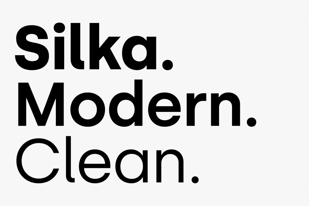
Typeface
The primary brand typeface is Silka. It works to strengthen the brand look and feel and to express the Unstoppable personality.
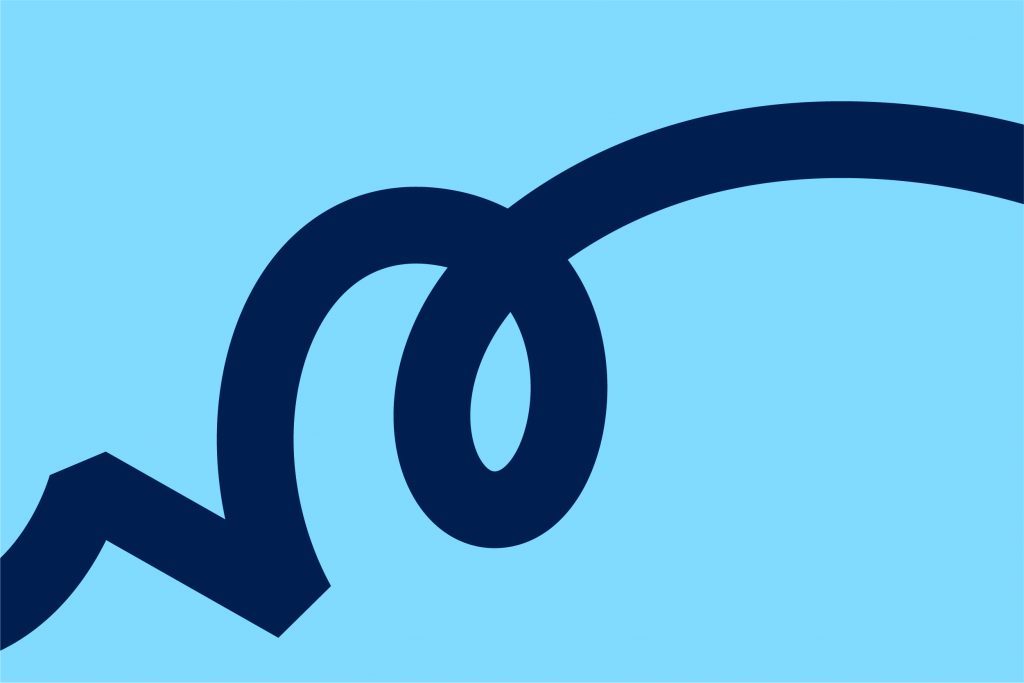
Visual and illustrative style
The UC visual and illustrative style can be used to deliver immediate impact by separating the logo and placing it as a dynamic element within the layout of the design.
Updated 2021/04/16
We use the logo wherever possible, exclusively in the form described by this manual. When working with the logo, we always use only the original variants from the Download section.
This wordmark below is the primary logo of Unstoppable Conversations.
In this section, we present the two other versions of our logo. These include the symbol (monogram) and the extended version of the primary logo. Based on the type of communication, the correct version of the logo should be chosen. For an overview of logo usage, take a look at this section.
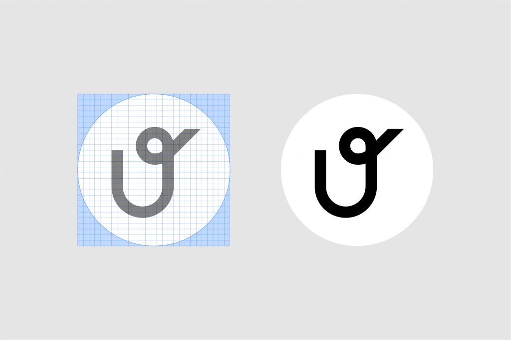
Below, there is a symbol (monogram) version of our logo. This version should mostly be used for profile images on social media.
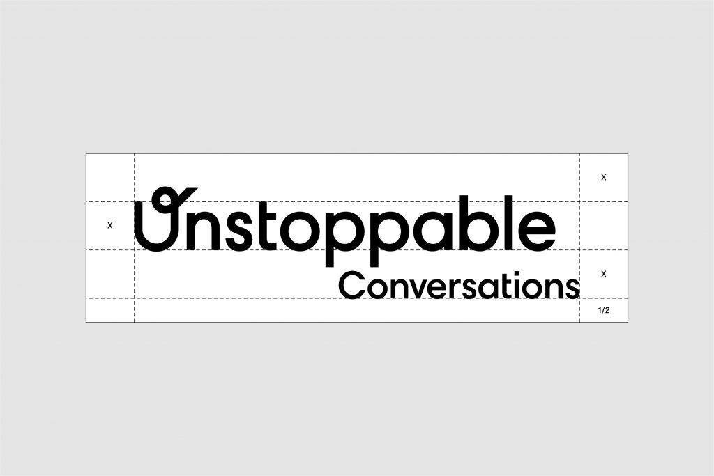
Once our customers are within our environment (e.g. within the website, social media pages), our brand communications can rely on our primary wordmark. But there are moments (e.g. posters, signage, ads) when our communication needs to give more information about our brand. For all those moments, please use the Extended logo lockup.
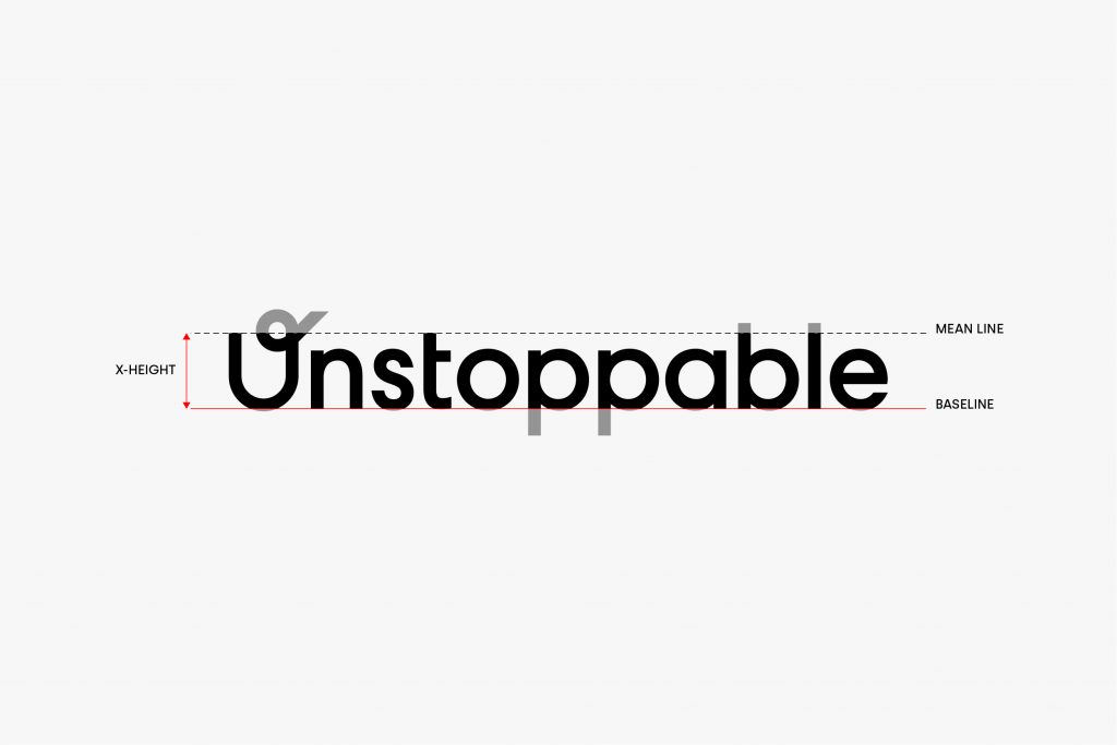
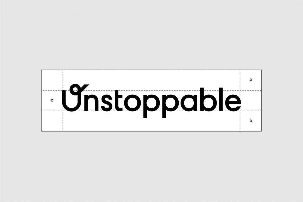
The clear space is the zone around the logo which must not be interfered with by any other elements. This zone of our wordmark is determined by the “x-height”, which is a typographic unit that is measured from the baseline to the mean line.
Having sufficient space around the wordmark and monogram makes our designs look better and gives the logos the appropriate visual hierarchy.
To ensure the monogram is presented properly, please always use this example.
When using the logo, it always must be legible and recognizable. Therefore, we do not use it in a smaller size than specified below. The maximum size of the logo is unlimited as long as the prescribed protection zone is maintained.
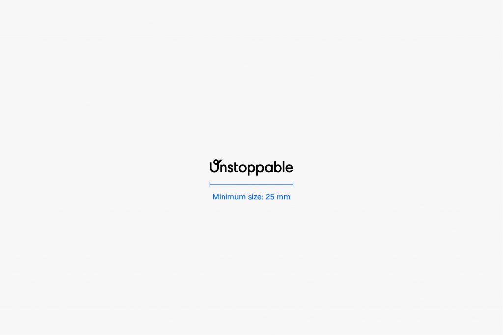
The primary logo must always be at least 25 mm wide.
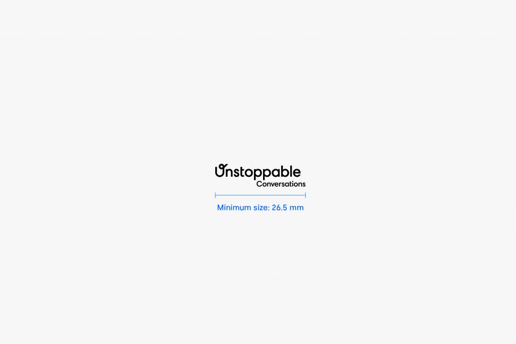
The extended logo must always be at least 26.5 mm wide.
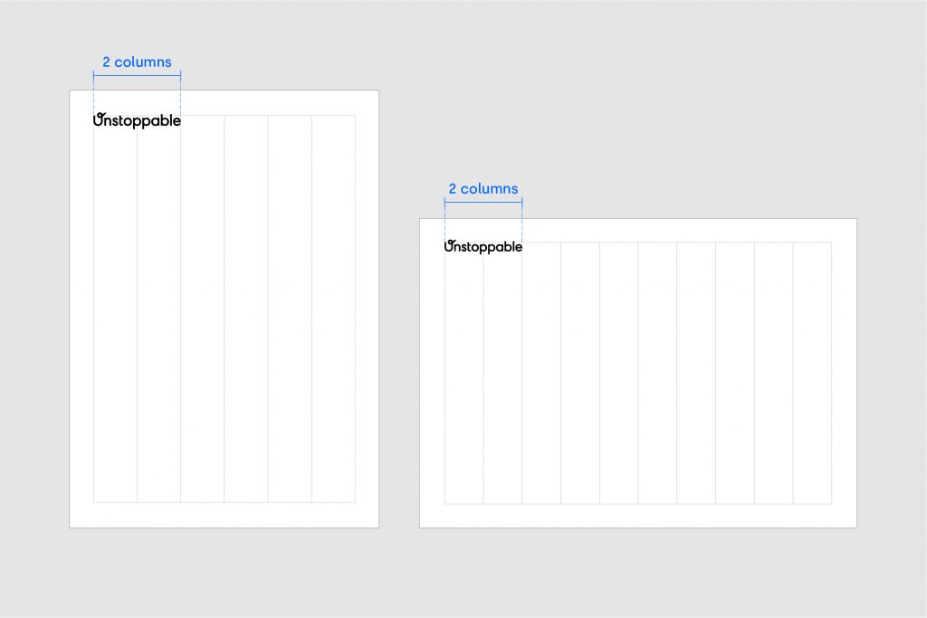
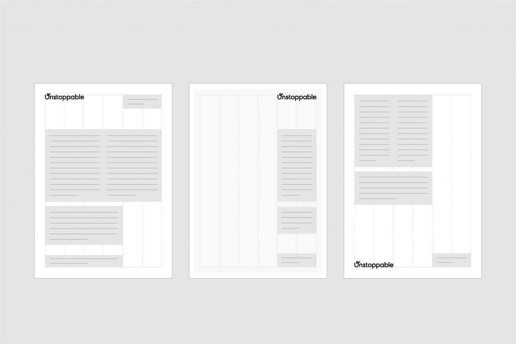
The primary position for our wordmark is the top left corner and locked to the margin. However, our wordmark position is flexible and can respond to the content of the application. Below are examples of alternative positions for our wordmark.
Choosing the right mark
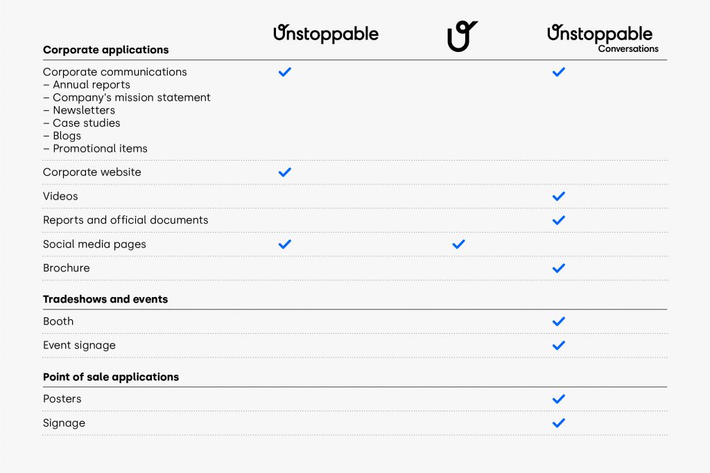
The following tables show how to choose the right mark for your communication. To comply with our standards, the Unstoppable Conversations wordmark is mandatory when indicated.
Our primary logo color is UC Marine Blue. However, there are other color versions available for use. If you are considering using another colorway, always use original artwork. These are available in all formats to download from our brand site. Do not modify the artwork in any way.
The examples shown opposite should be used as a guide for selecting the correct Unstoppable signature for your background. Be responsible, not reckless. We must not forget to give the logo precedence – it should always be the most vital and visible element of our communications.
White logo on black background
Black logo on white background
Black logo on light background
White logo on dark background
Examples of logomark misuse are shown here. These treatments are not acceptable. Any alteration of the logomark negatively affects the integrity of our brand. Please always use approved logomark artwork to ensure design consistency.
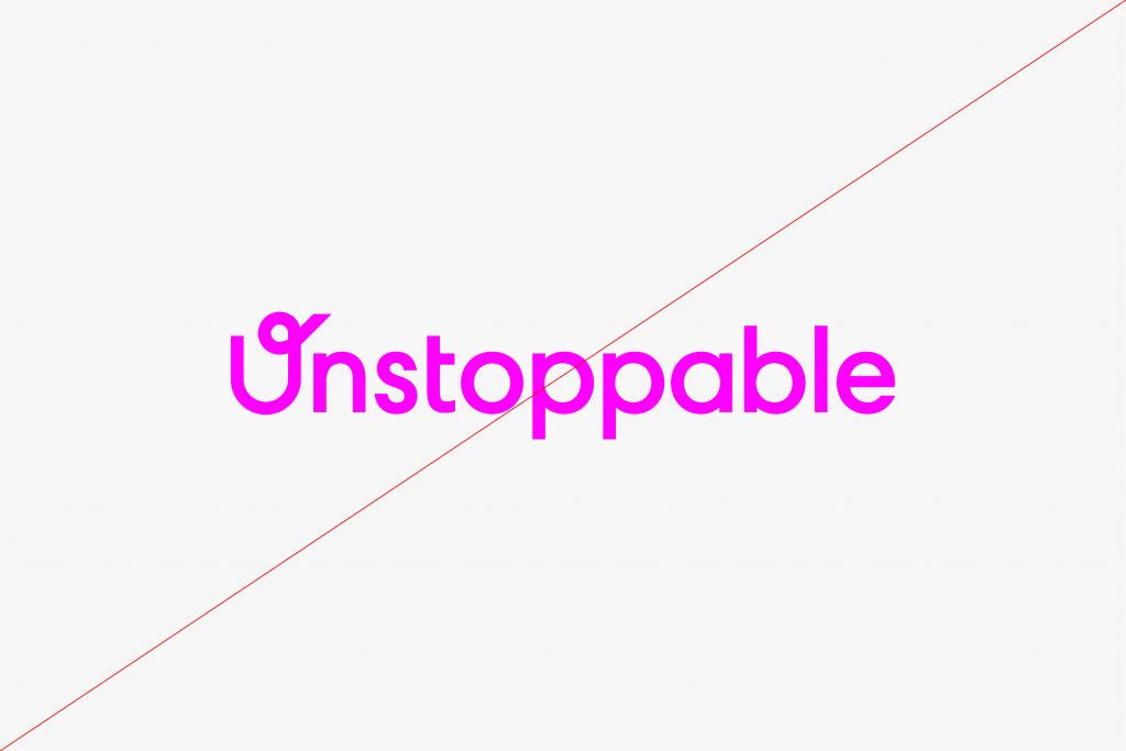
Do not recolor the logomark.
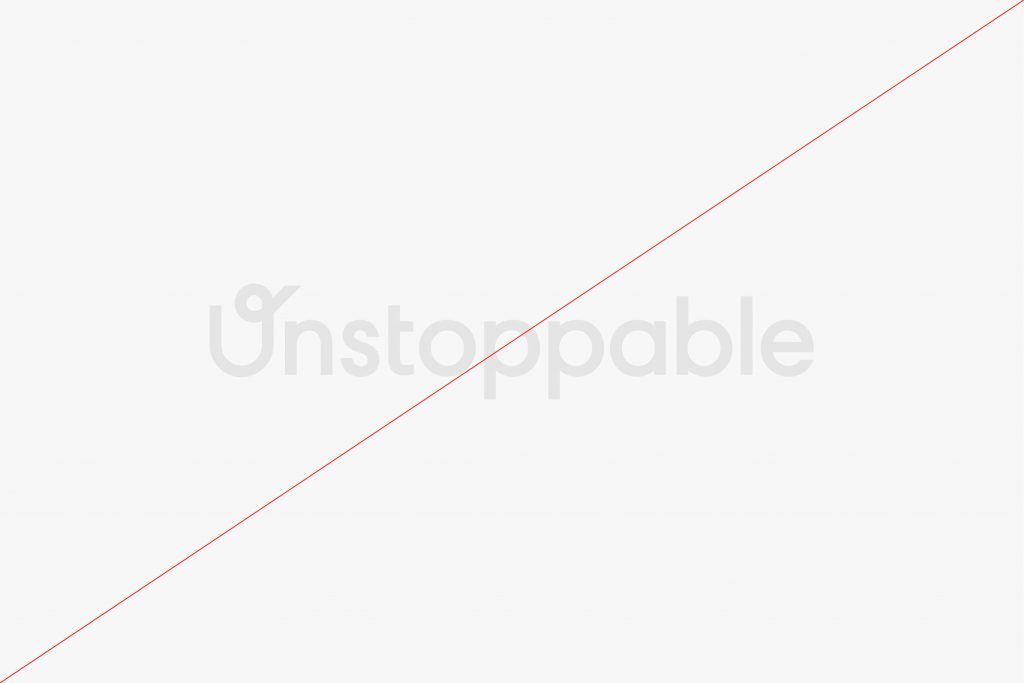
Do not tint the color of the logomark.
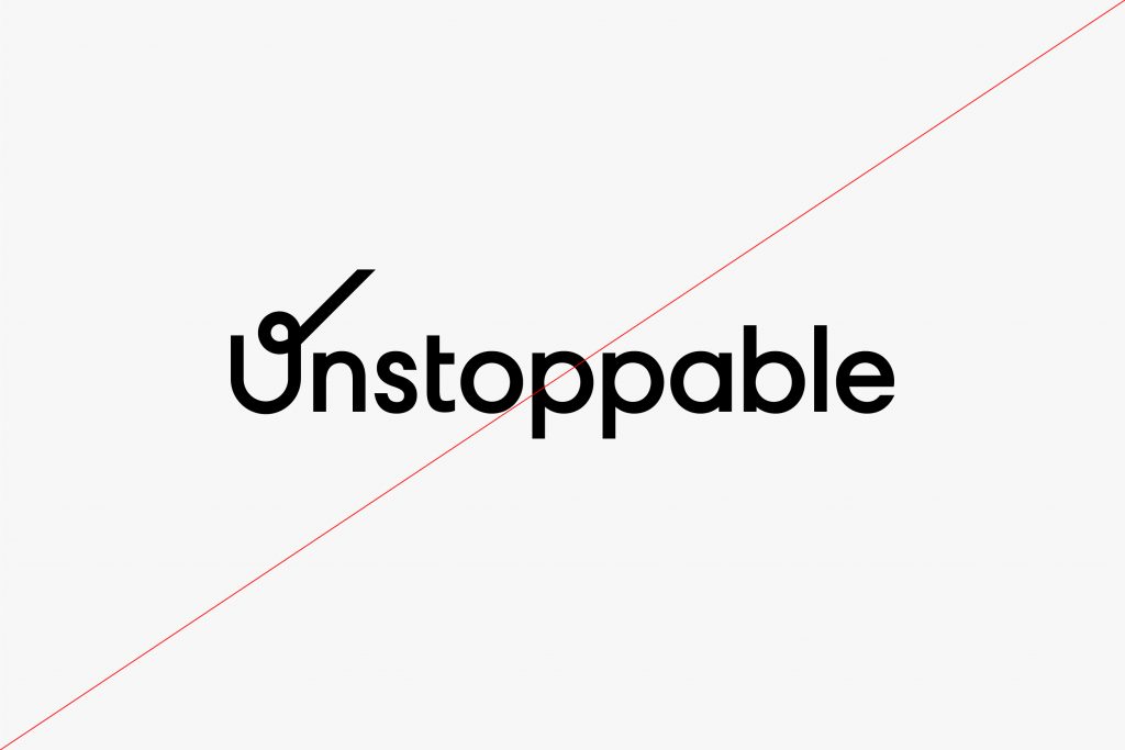
Do not modify the logomark.
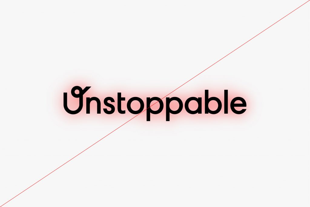
Do not add a shadow to the logomark.
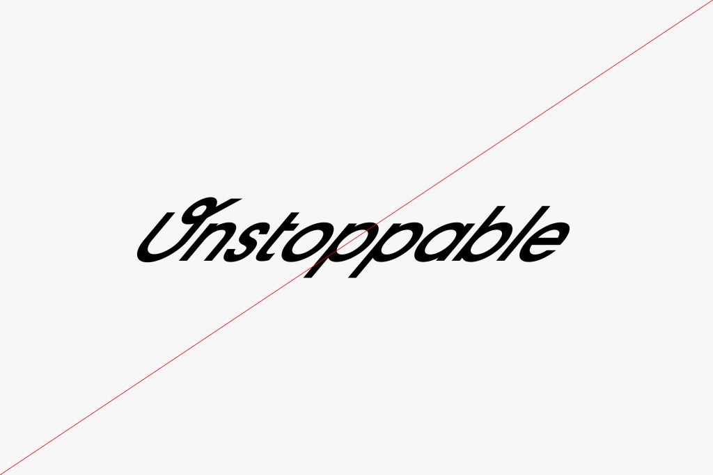
Do not skew or condense the logomark.
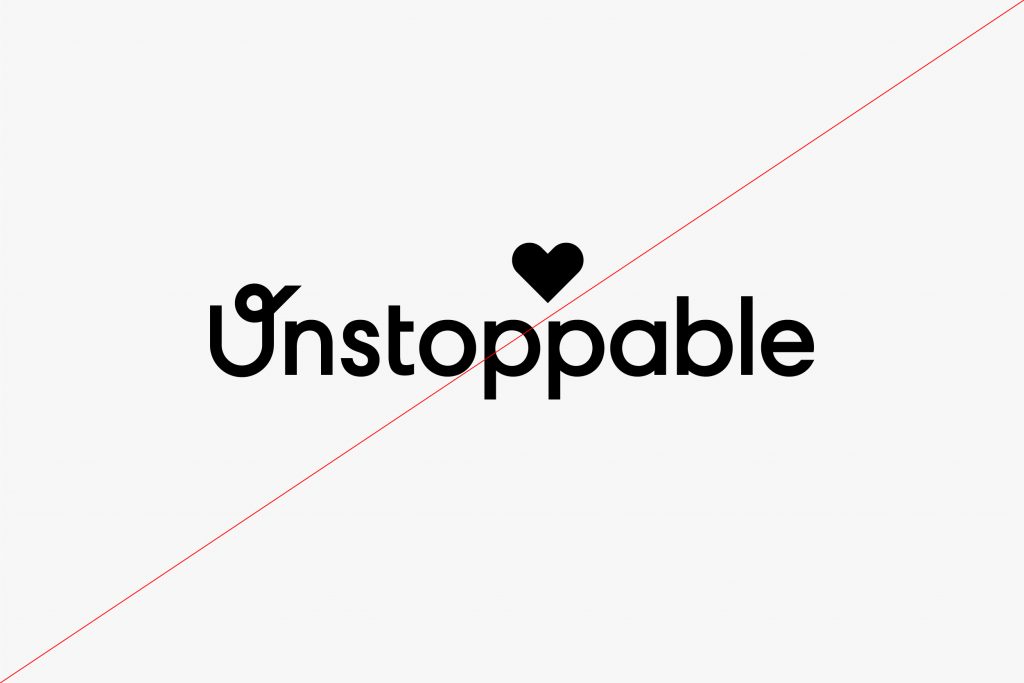
Do not add foreign elements to the logomark.
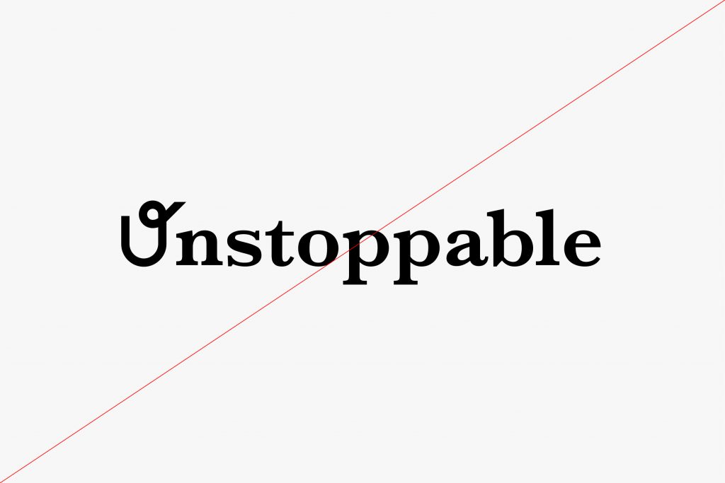
Do not retype the logomark.
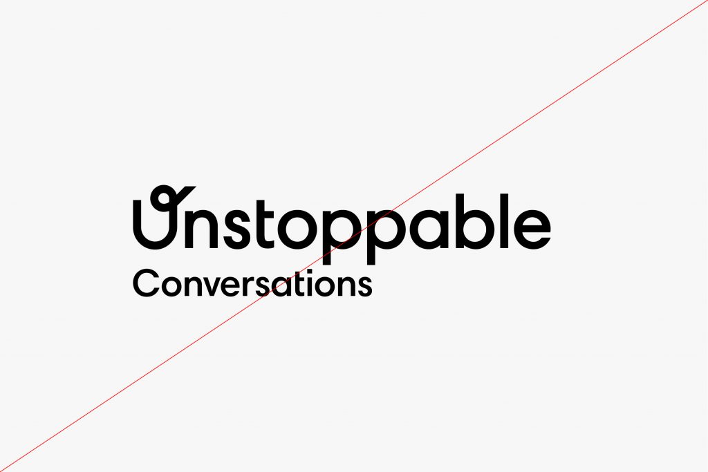
Do not change the position of the lockup.
Updated 2021/04/09
For internal uses and across the web, mobile, and desktop (our computers,
PowerPoint presentations, etc.), the recommended fonts are:
For licensing, or to purchase and download Silka, visit this link.
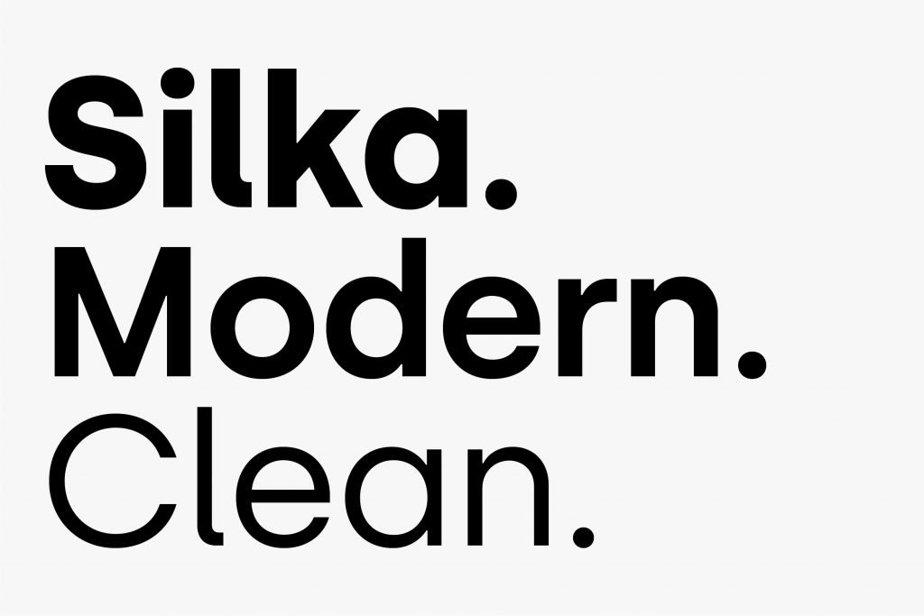
The primary brand typeface is Silka. It works to strengthen the brand look and feel and to express the Unstoppable personality.
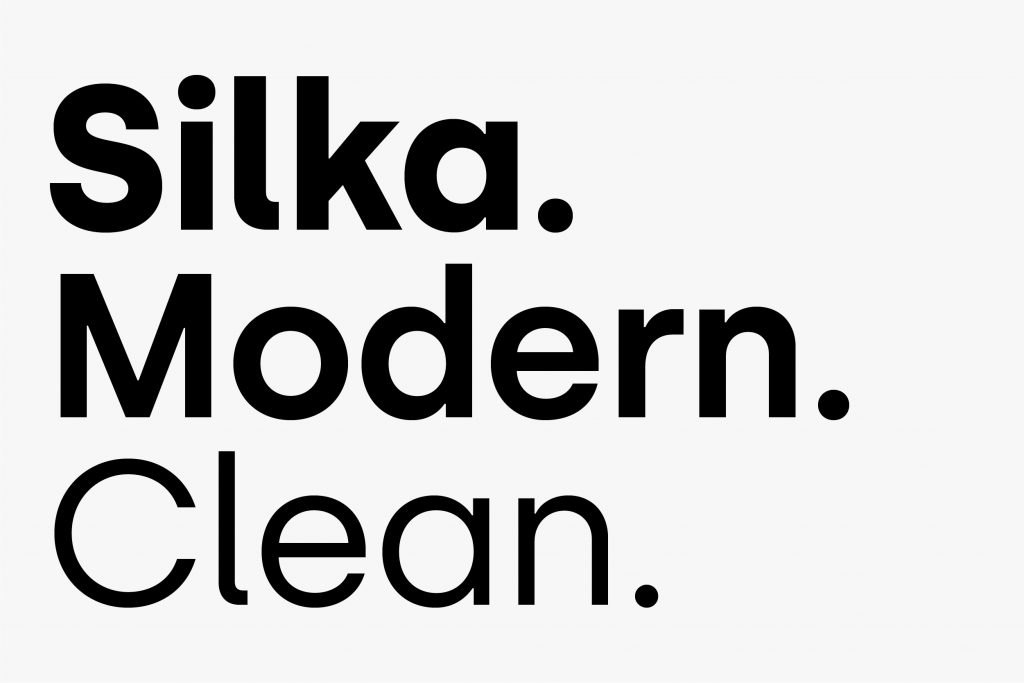
Unstoppable texts are set in Silka. When using Silka on embedded or printed collateral for Unstoppable, always typeset it with Optical kerning, set the tracking to 0, and set it in sentence case. Do not set in all-caps or all-lowercase.
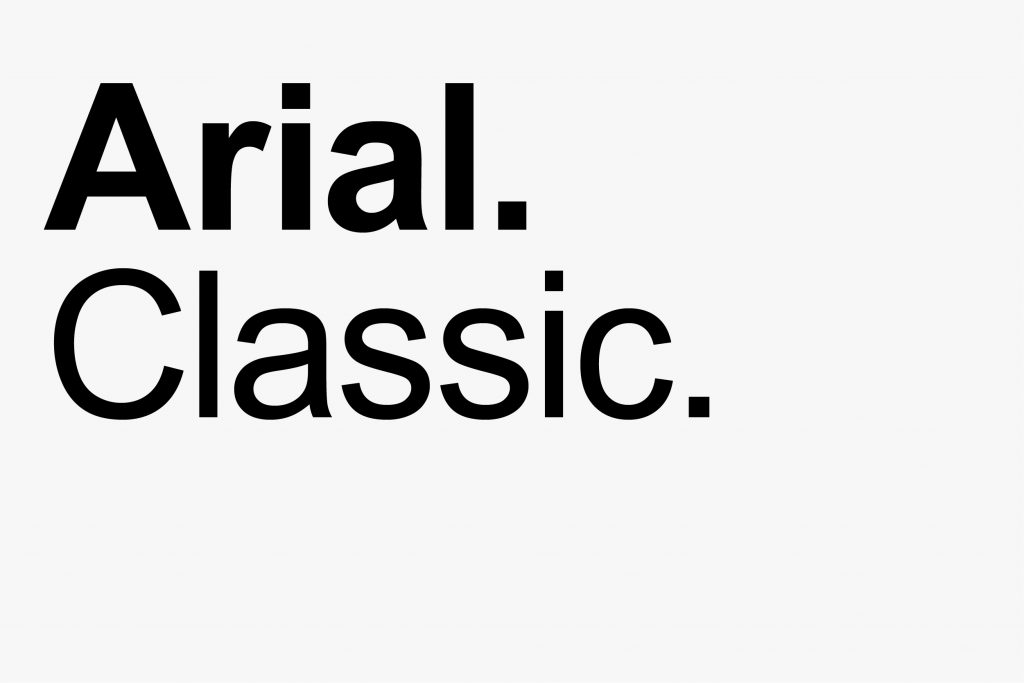
Arial may be used on any computer when Silka is not available. It can be used in Regular or Bold weights.

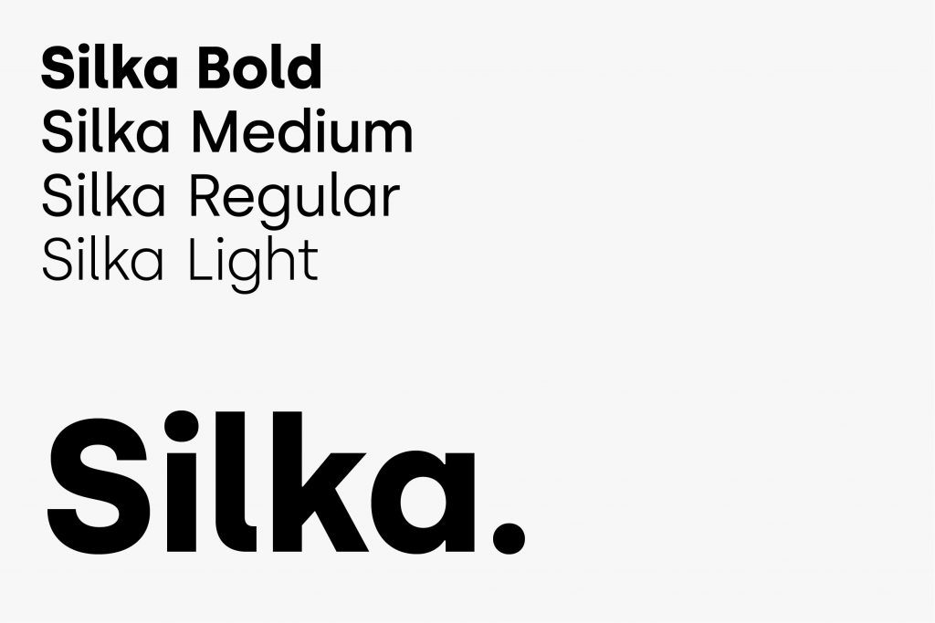
It is important to maintain the type pairings. This allows for clarity, consistency, and a strong hierarchy for all communications. Bold weight should be paired with Medium weight, and Medium weight should be paired with Regular weight.


It is important to organize typography in a hierarchical system according to relative importance or inclusiveness through scale and function depending on communication.
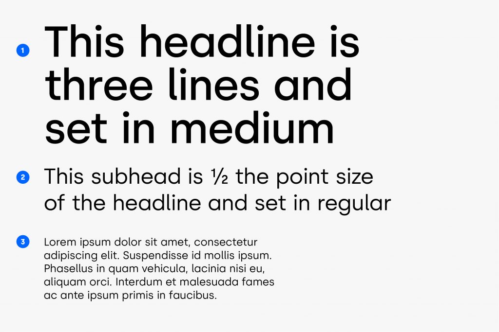

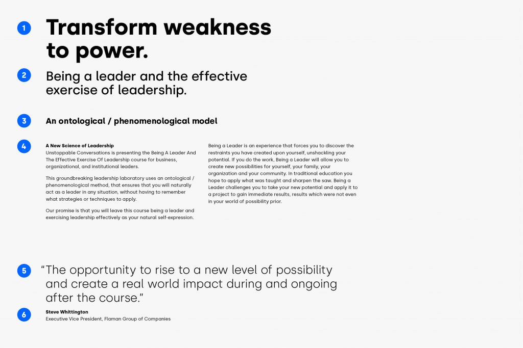
1. H1
Silka Bold, 38/40 pt
2. H2
Silka Medium, 22/24 pt
3. H3
Silka Bold, 14/16 pt
4. Copy body
Silka Book,
Style Set 2,
Optical Kerning,
0 Tracking
5. Pull Quote
Silka Light, 20/24 pt
6. Attribution
Silka Bold/Regular, 8/12 pt
Updated 2021/04/16
The use of color is an important aspect of the Unstoppable Conversations identity. The primary colors are UC Marine Blue, White, UC Light Blue, and UC Yellow.

UC Marine Blue
RGB — 0 31 81
CMYK — 100 89 41 39
HEX — 001F51
Pantone — 275C

White
RGB — 255 255 255
CMYK — 0 0 0 0
HEX — FFFFFF
Pantone — White

UC Light Blue
RGB — 128 219 255
CMYK — 49 0 0 0
HEX — 80DBFF
Pantone — 297C

UC Yellow
RGB — 255 249 128
CMYK — 6 0 59 0
HEX — FFF980
Pantone — 100C
We use a supporting palette to highlight specific things like numbers and icons or data visualizations. Do not use secondary colors for text. Secondary colors can be used with our core colors, but this should be limited.

UC Parsley
RGB — 0 175 62
CMYK — 100 0 100 0
HEX — 00AF3E
Pantone — 360C

UC Teal
RGB — 0 167 148
CMYK — 74 0 45 0
HEX — 00a794
Pantone — 3275C

UC Red
RGB — 226 46 18
CMYK — 0 90 100 0
HEX — e22e12
Pantone — Red 032C

UC Mandarin
RGB — 239 144 32
CMYK — 0 53 100 0
HEX — EF9020
Pantone — 137C
These examples should be used as a guide for selecting the correct option (Black or White) for your background.
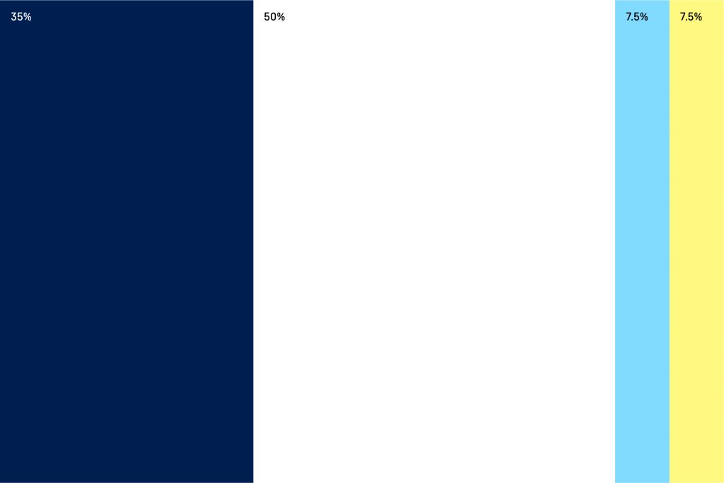
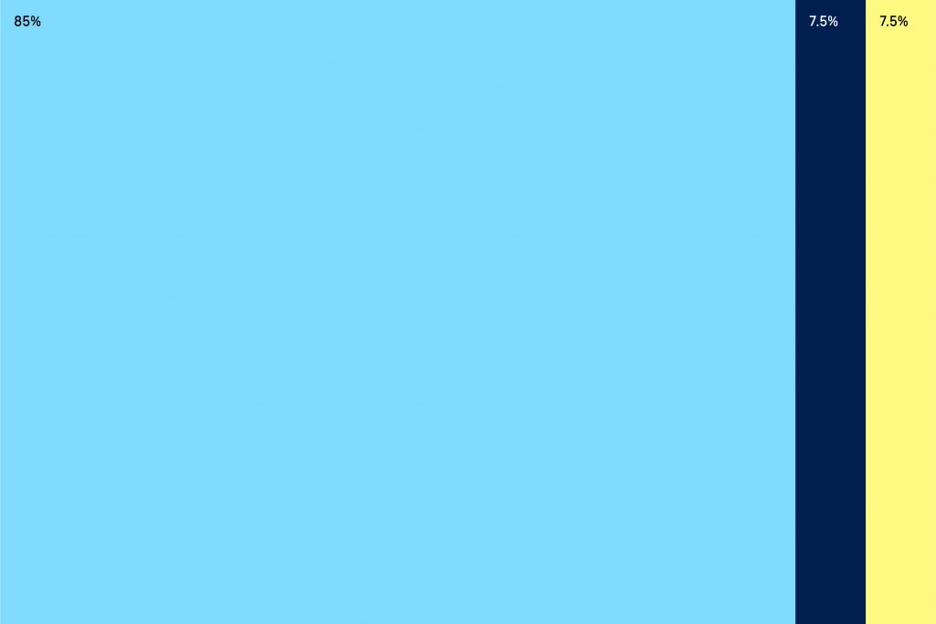
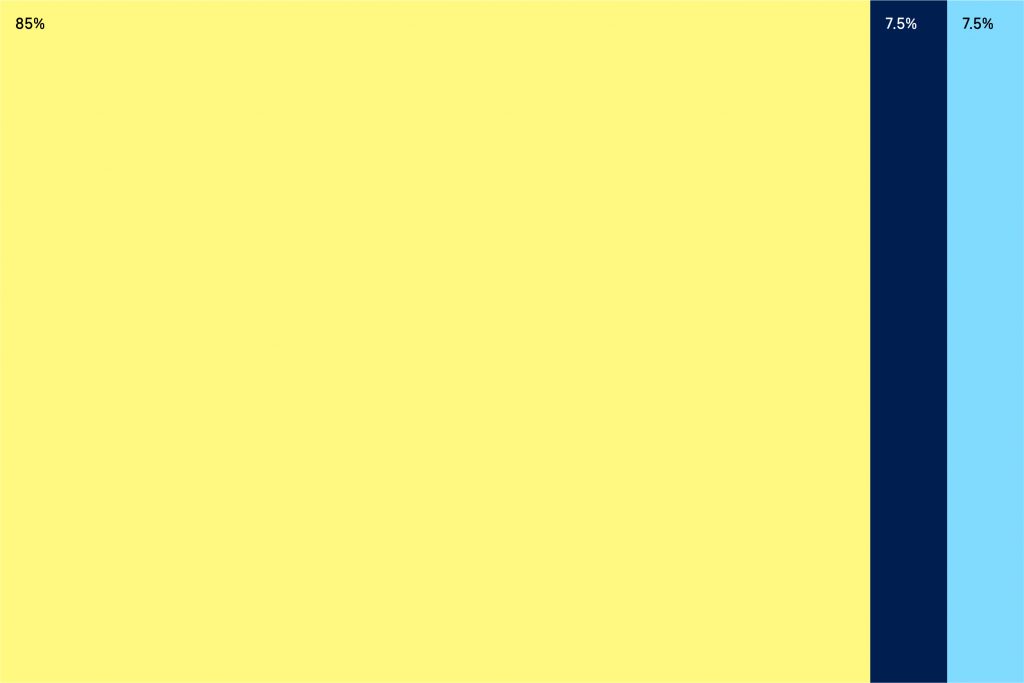
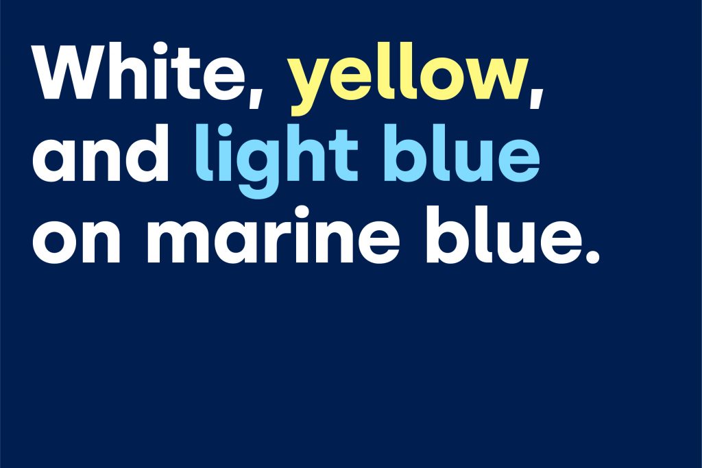
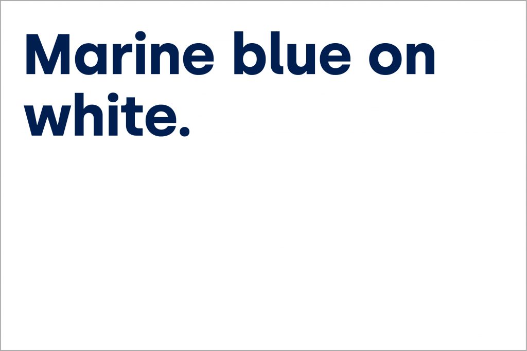
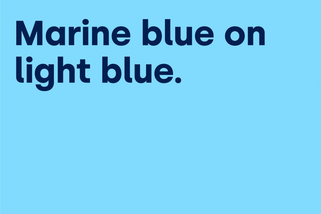

To ensure information and data are communicated clearly and concisely, you need to select the most appropriate colors, thus don’t hesitate to combine our primary and secondary color palettes. Infographic colors should match the colors of the document you are designing.
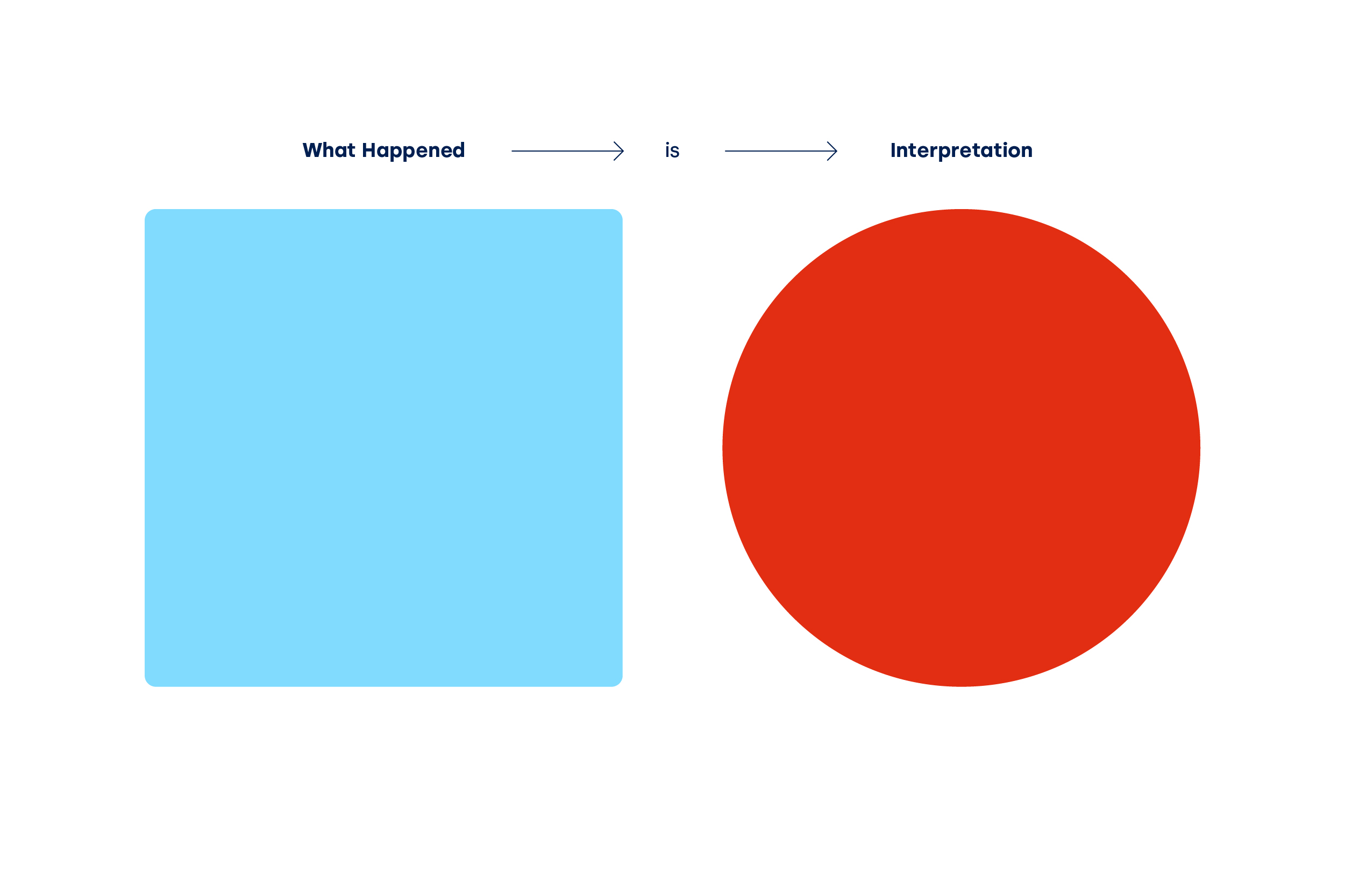
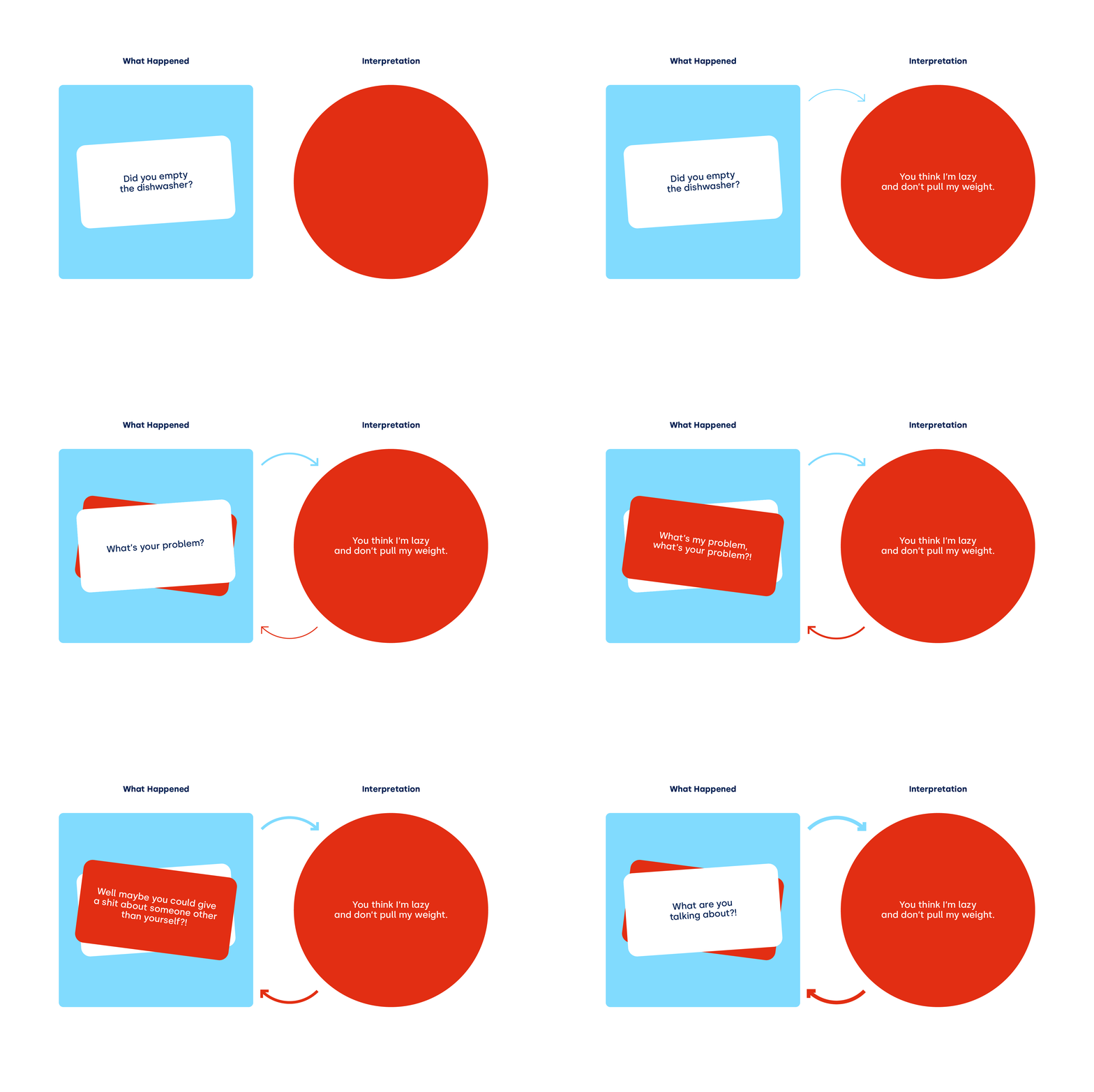

Updated 2021/04/09
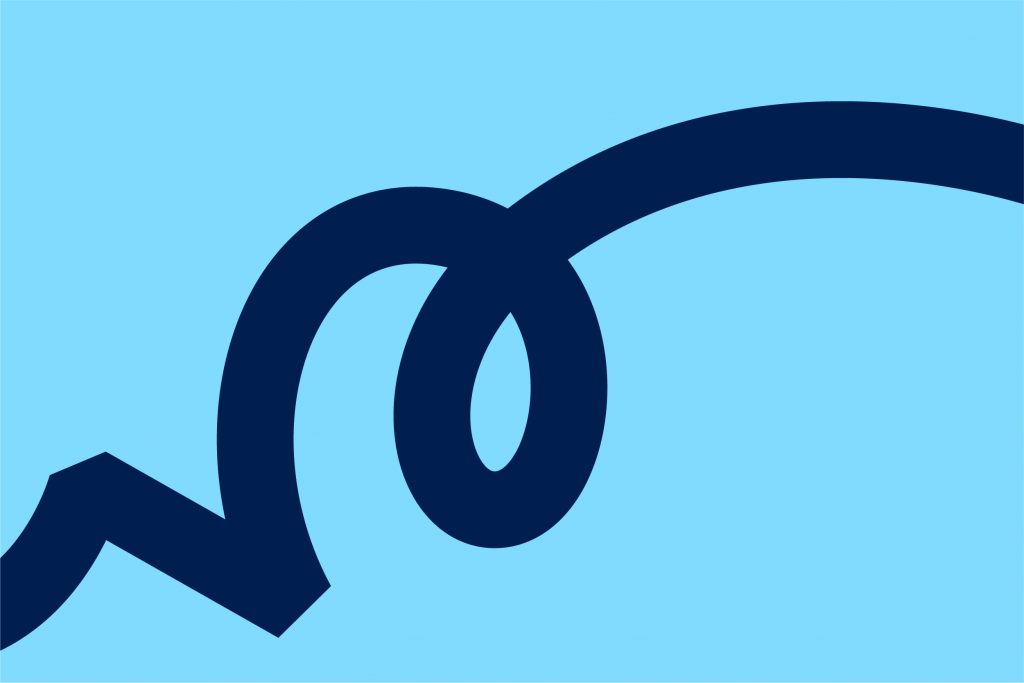
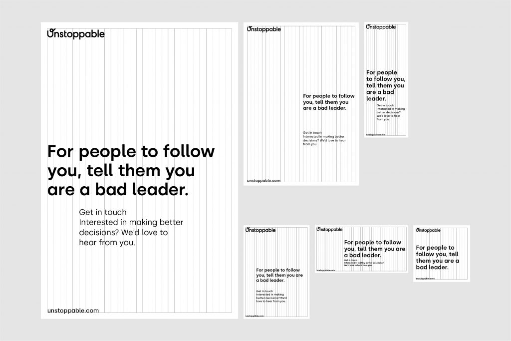
The grid system maintains a consistent visual identity for the Unstoppable brand.

The column grid is the underlying grid divided into six columns. It creates an ideal framework for marketing literature.
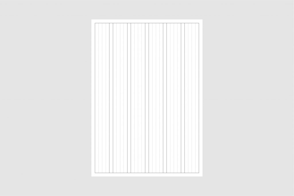
Displayed below, you can find the way how we use the column grid and create different compositions.

These are the options for working with composition using text, element, with or without images.
Our element can be used in the full-bleed option. It can work as a fraction coming from any side of a format or can start from an edge of a format ending freely inside the format.
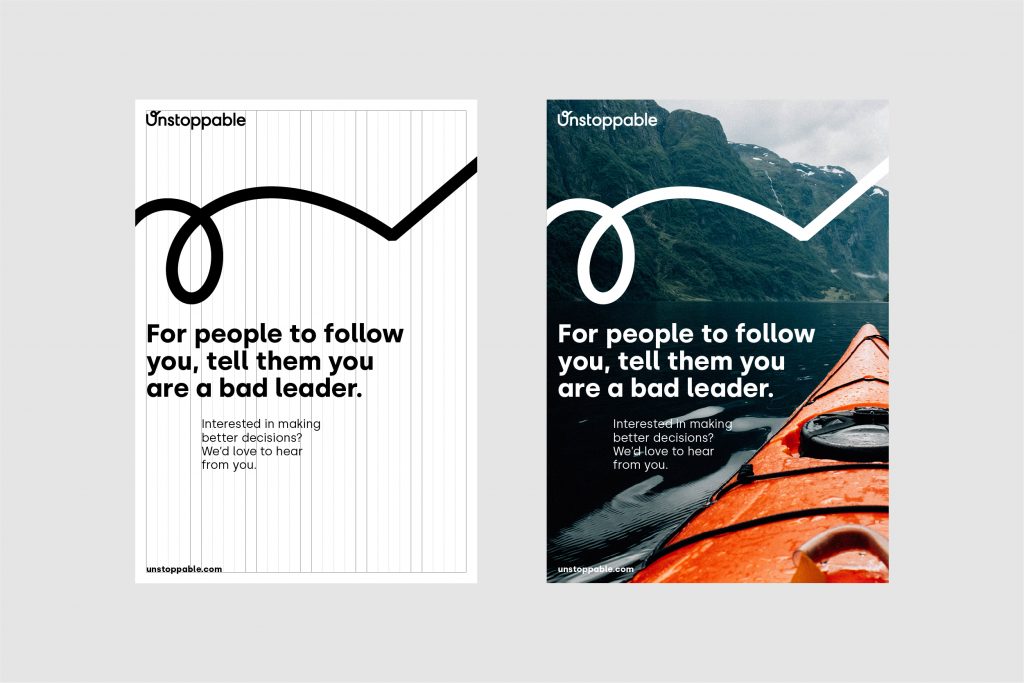

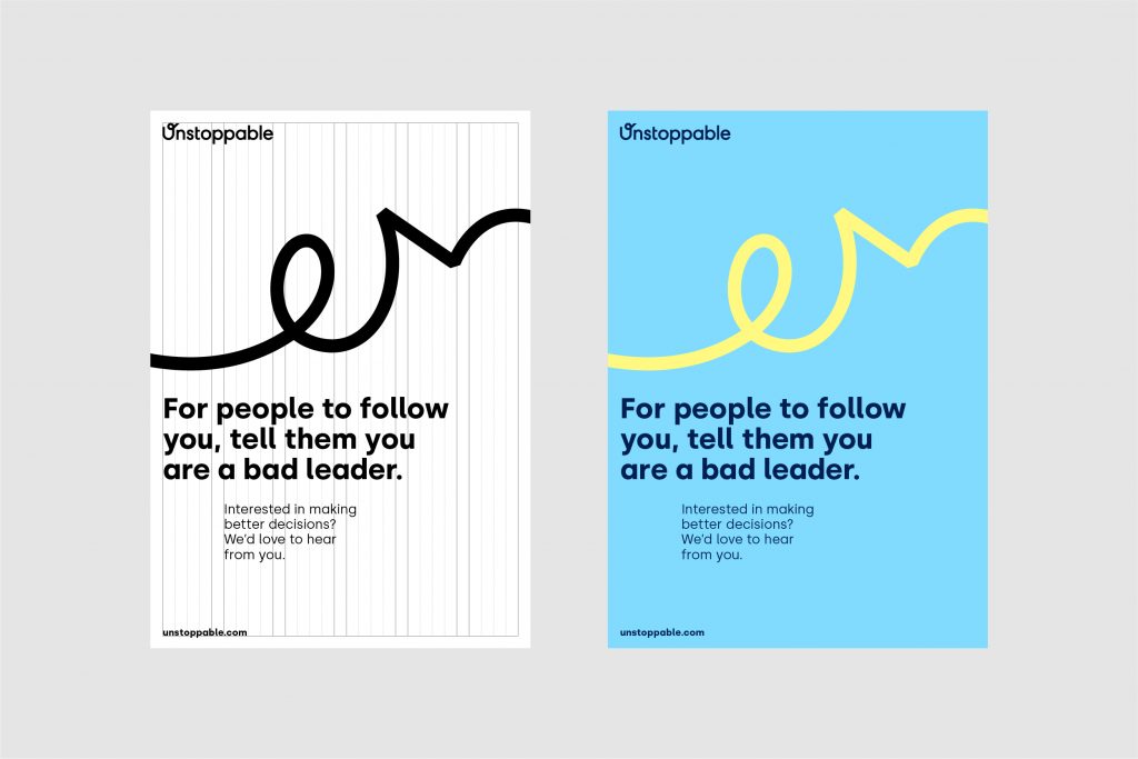
Our path symbol is made up of a stroke that symbolises our client’s journey through its career, and it shows the variabilities, the fact that nobody has linear development, but a journey that can be wobbly and unpredictable, but in any case, it’s a never-ending process.
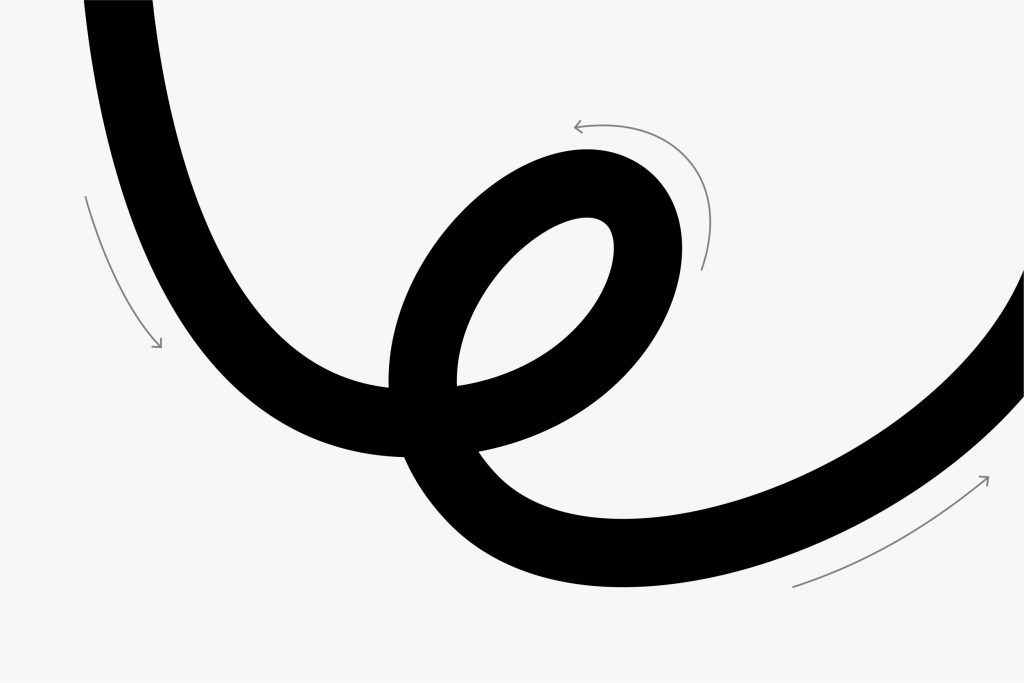

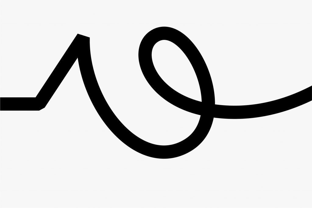
Examples of appropriate usages of our path symbol are shown here.
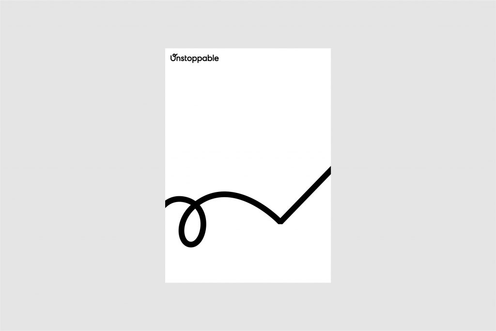
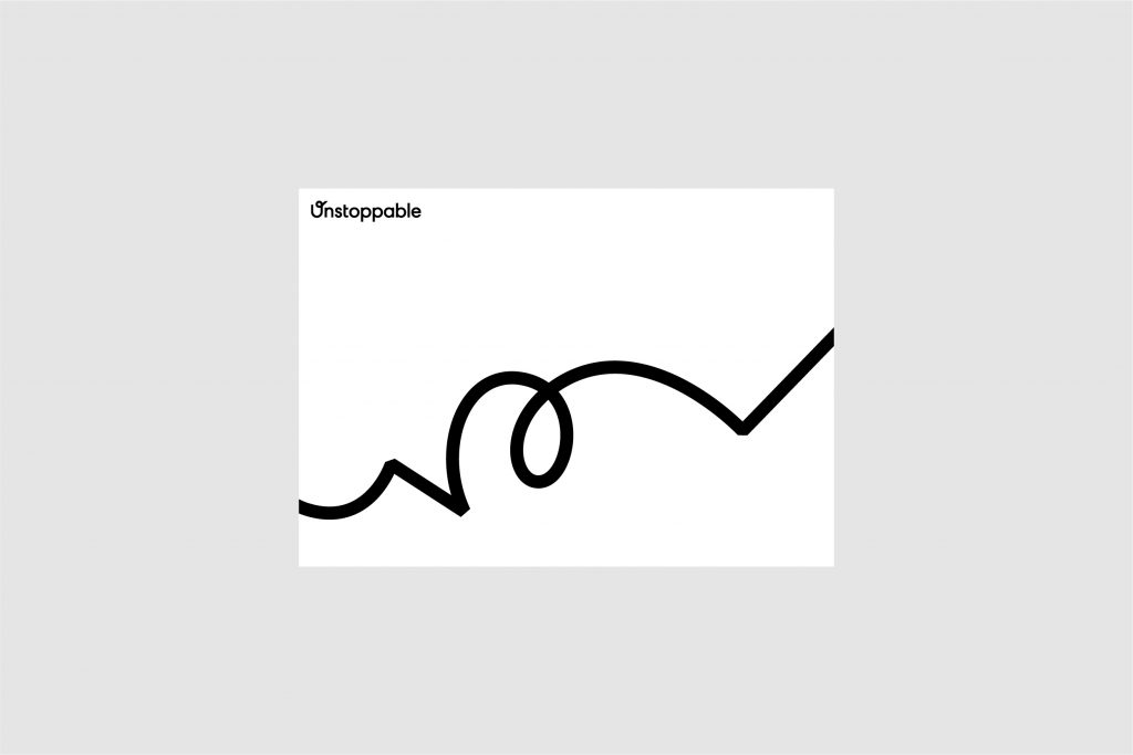
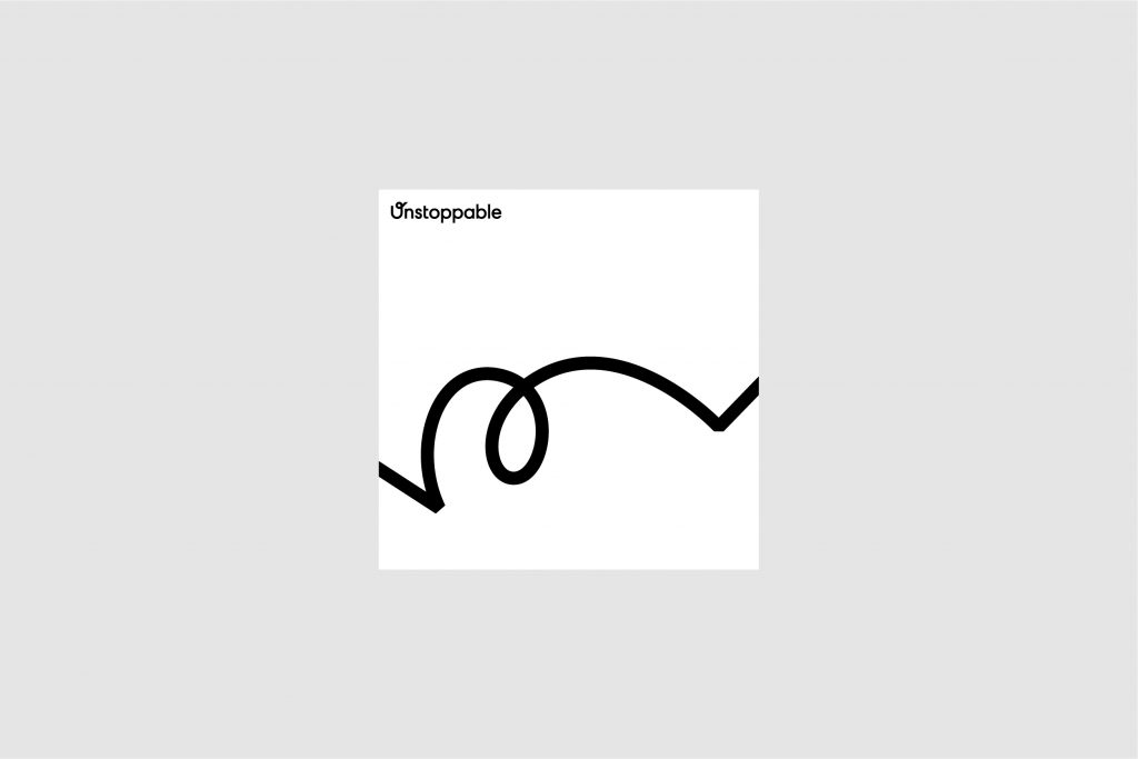
To ensure the path symbol is communicated clearly and concisely, you need to select one of the existing examples.
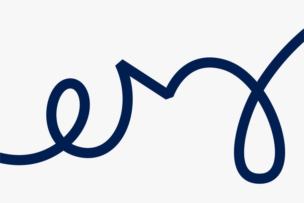
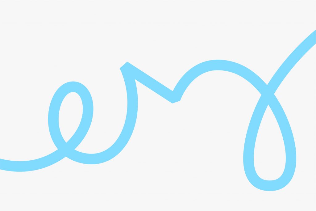
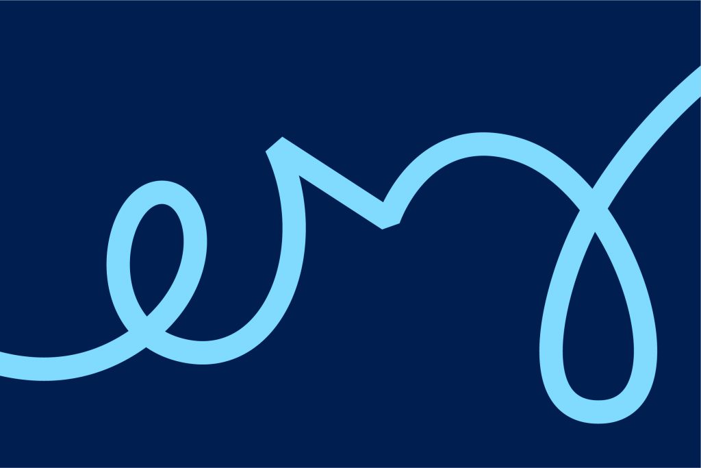

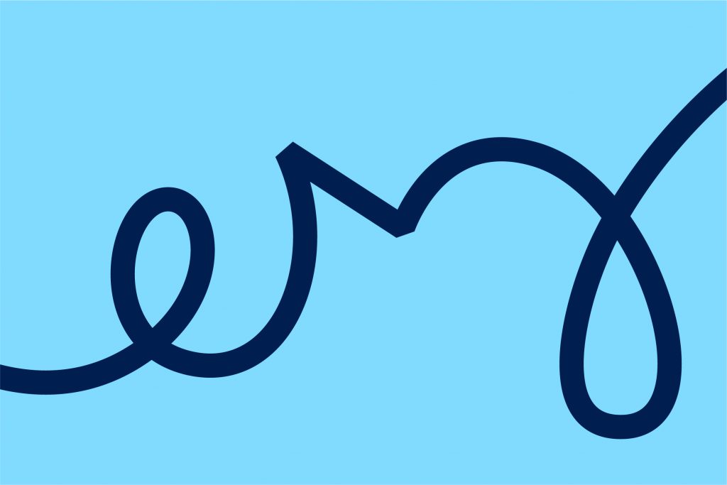
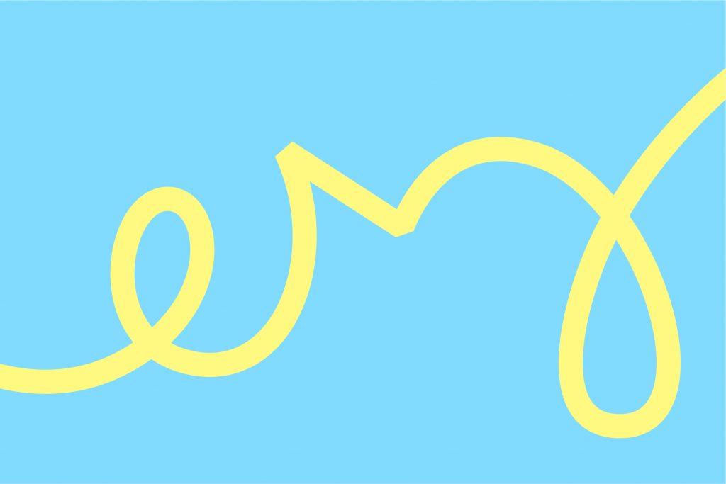
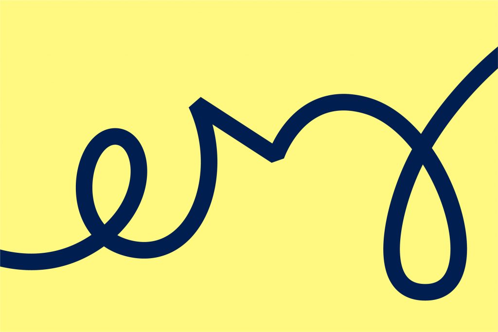
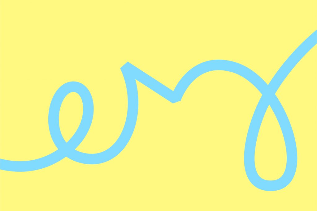
Our element allows us to create different illustrations.

Updated 2021/03/22
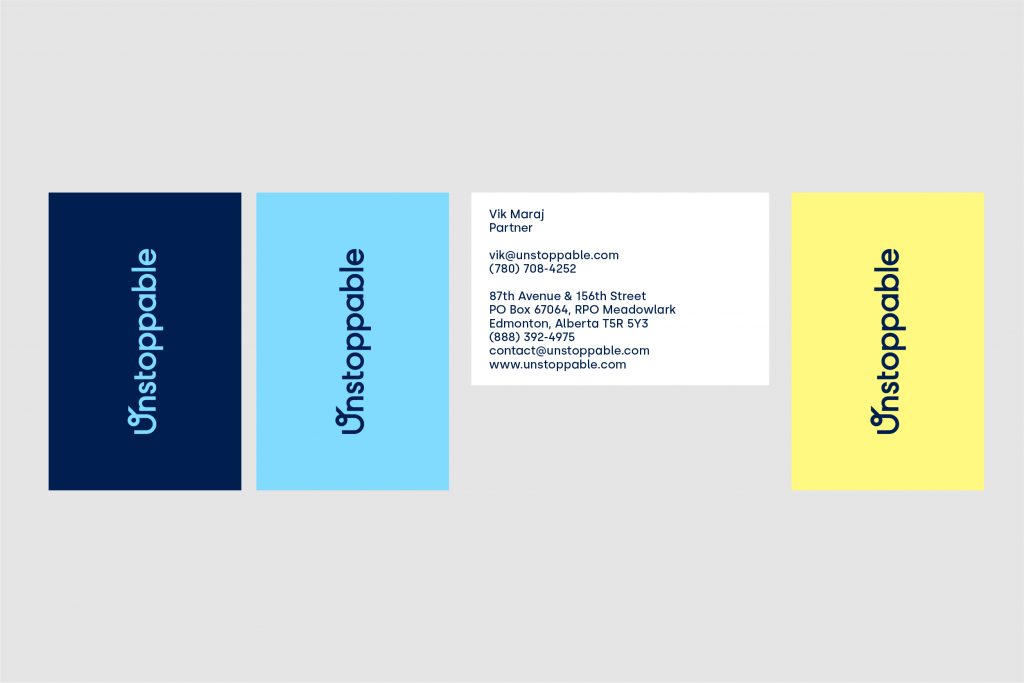
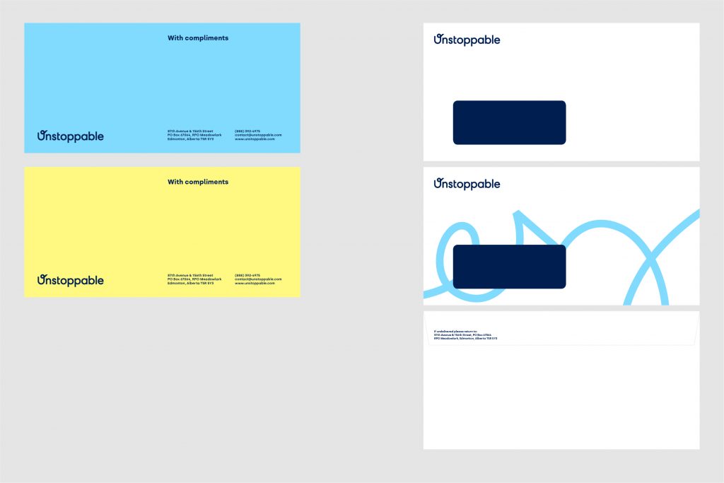
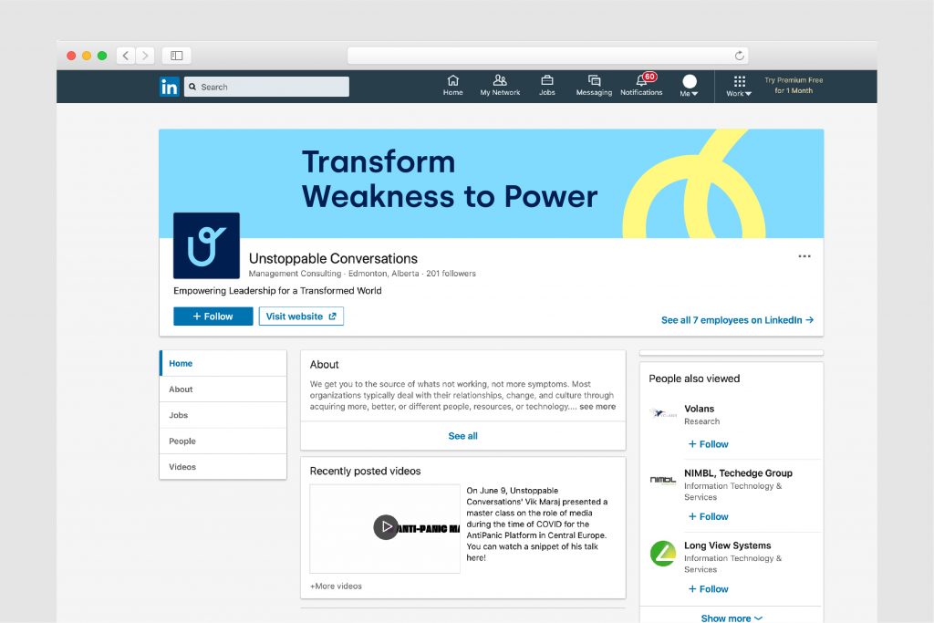
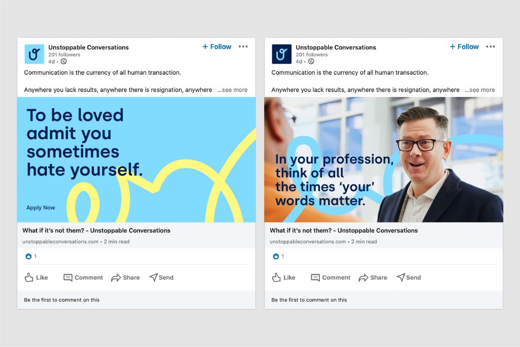
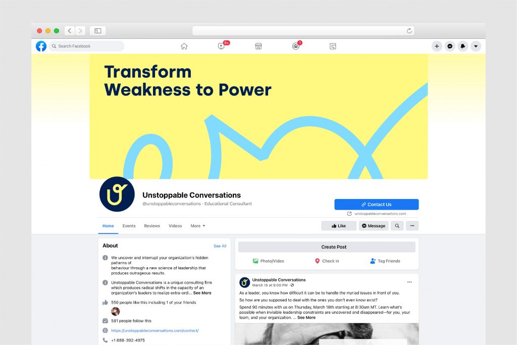
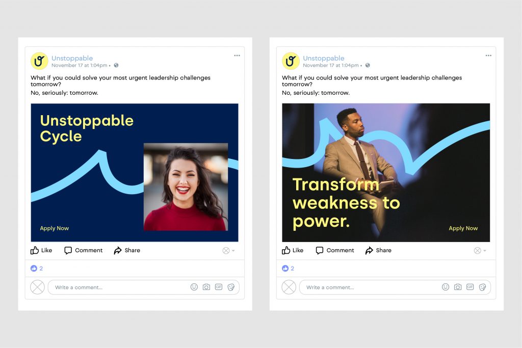
This section demonstrates how the visual elements work together and shows how each element should be applied.

Updated 2021/03/19